Designing Labels with One Color Ink.
The Navigator Wine Company takes a restrained approach with its Circumference brand, embracing a level of simplicity rarely seen in wine packaging. Rather than relying on multiple print colors, elaborate graphics, or decorative embellishments, the entire design is built around a single ink color.
That same color flows seamlessly from the artwork on the bottle's body into the neck, unifying the package as a single continuous composition. Instead of treating the neck and body as separate elements, the neck print extends the design upward, creating visual continuity and a stronger overall presence without the need for additional decoration.
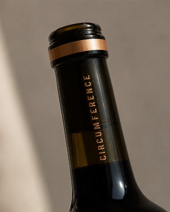
What makes this piece stand out is how much visual movement it creates with only one ink color. The circular pattern wraps partially around the bottle, building texture, depth, and reflection through the interaction between ink and dark glass.
The result feels dimensional without becoming overly complex.
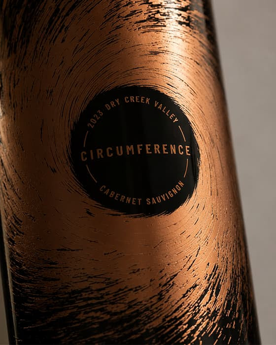
The open space at the center of the design creates a natural frame for the typography, allowing it to remain clear and prominent without competing against dense graphics or decorative elements. By giving the artwork room to breathe, the design draws attention through balance rather than complexity. It’s a compelling example of how thoughtful placement, restraint, and the interaction between ink and glass can create a strong visual presence with remarkably few elements.
At Monvera, we help translate ideas like this onto glass — balancing artwork, ink, bottle shape, and production constraints so the final result feels intentional from every angle.
Working on a new concept?
Share your concept — we’ll walk through finishes, print approaches and decoration options together.