A few years ago at the DTC Wine Symposium, a panelist joked about the modern winery website formula: the guy, the dog, the truck, and the vineyard. Beautiful backdrop, strong lifestyle photography, a thoughtful founder story. Polished, absolutely. Strategically distinct, rarely.
The critique wasn’t about branding. It was about structure. Most winery websites aren’t broken, but they aren’t built as decision environments either. Calls to action are unclear, revenue pathways are buried, shipping surprises appear late, and wine club often lives in isolation instead of throughout the buying journey.
After auditing winery sites across regions and production sizes, the pattern is consistent: performance is constrained by friction, not effort. Most wineries don’t have a traffic problem. They have a conversion architecture problem.
Before increasing ad spend or launching another promotion, run a winery website audit — on your phone. Start at the homepage and move through shop, product, cart, and checkout. If friction appears anywhere in that mobile journey, conversion suffers.
What follows is a structured framework to evaluate and strengthen that architecture.
Why Website Architecture Matters More in Wine
Wine is not impulse eCommerce. Purchasing decisions involve shipping constraints, case incentives, club pathways, event-driven buying, compliance limitations, and emotional triggers tied to occasion.
Small structural decisions, how value is framed, how thresholds are presented, and how club benefits are surfaced, directly influence revenue performance.
High-performing wineries do not simply market more aggressively. They design buying behavior intentionally.
The 9-Part Winery Website Audit Framework
1. Homepage Structure: Does It Guide or Just Exist?
A winery homepage has to support multiple revenue paths at once. It must help customers:
- Buy wine
- Plan a visit
- Book tastings
- View events
- Explore and join the wine club
If any of those pathways are difficult to find, especially on mobile, revenue friction follows.
In one audit, a winery concerned about declining tasting room traffic had hours and booking information buried under “Contact Us.” On mobile, it required multiple taps to confirm whether they were open.
In another case, a winery struggling with event attendance had no centralized Events page. Promotion lived on Eventbrite and social media, but the website itself did not function as the source of truth.
Nothing was broken. The structure simply did not support intent.
When reviewing your homepage, start on mobile and evaluate:
- Is the primary action clear within seconds?
- Is “Visit Us” immediately accessible?
- Are events centralized and easy to browse?
- Is wine club visible without digging?
- Are current releases or best sellers surfaced intentionally?
Best Practice Improvements:
- Surface tasting room hours and booking links above the fold on mobile.
- Create a dedicated Events page or calendar that lives on your site.
- Feature 3–5 best-selling wines or seasonal bundles prominently.
- Reinforce shipping thresholds or case incentives on the homepage.
- Position wine club as an upgrade throughout the site, not a standalone tab.
Brand storytelling matters. But homepage performance improves when structure reflects how customers actually interact with your winery, both online and in person.
2. Visit Us: Clarity Drives On-Site Revenue
For many wineries, tasting room revenue remains foundational. Yet “Visit Us” information is frequently under-structured.
Customers navigating to your site to plan a visit are not browsing casually. They are looking for specifics:
- Hours
- Reservation requirements
- Walk-in policy
- Group size limits
- Pricing
- Location and directions
When this information is buried under “Contact” or mixed into event pages, friction increases.
Audit your Visit Us experience:
- Are hours visible without scrolling extensively on mobile?
- Is reservation policy clearly stated?
- Are booking links obvious?
- Are policies (groups, pets, outside food) easy to understand?
- Is location information clear and tappable on mobile?
- Are FAQs centralized?
Tasting reservations should not be mixed with weddings or private event inquiries. The intent is different. The information required is different. The urgency is different.
A clean Visit Us section reduces inbound phone calls, increases booking confidence, and protects on-site revenue.
3. Events and Private Bookings: Revenue That Should Not Be Buried
Events are often treated as marketing support. In reality, they are revenue drivers.
Internal events, winemaker dinners, release parties, club pickups, and seasonal festivals create urgency and increase both on-site and online purchasing. Private bookings, weddings, corporate events, and rehearsal dinners represent high-value opportunities that should be clearly presented and easy to inquire about.
Yet in many winery audits, event information is fragmented:
- Buried under “Visit Us”
- Mixed into tasting reservations
- Hosted only on Eventbrite
- Hard to find on mobile
- Missing entirely from navigation
Event architecture should be intentional.
Public events, private bookings, and tasting reservations serve different customer intents. They should not live on the same page.
Evaluate your site structure:
- Is there a dedicated Events page or calendar hosted on your website?
- Are upcoming events easy to browse chronologically?
- Can users filter or sort events?
- Is ticketing integrated or clearly linked?
- Is event information mobile-friendly and skimmable?
- Are past events archived for credibility?
For private bookings:
- Is there a separate Weddings or Private Events page?
- Are capacity limits, space details, and amenities clearly outlined?
- Is there a dedicated inquiry form?
- Is contact information specific (not just a generic contact page)?
- Are images tailored to private events rather than tasting room shots?
Mixing these into tasting reservations creates confusion.
Someone booking a Saturday tasting does not need to see wedding capacity details. Someone planning a corporate retreat does not want to navigate through tasting slots.
Clear separation reduces friction and improves conversion across both use cases.
Events also reinforce wine club value. Member-exclusive events, early access ticketing, and VIP seating should be clearly tied to membership benefits throughout the site.
When structured well, events become a measurable revenue stream, not just a marketing calendar.
4. The Shop Page: Your Merchandising Engine
Before a customer reads a single tasting note, they land on your collection page, whether it’s called “Shop All,” “Current Releases,” or simply “Wines.” This page does more heavy lifting than most teams realize.
It is not just a product grid. It is your merchandising engine.
If the homepage introduces the brand, the shop page determines whether browsing turns into buying. Structure here directly influences exploration, basket size, and order composition.
Too often, this page is treated as a simple catalog: bottles listed chronologically, minimal prioritization, little differentiation, and no reinforcement of incentives. That approach assumes customers will do the work of sorting, comparing, and building their own logic.
High-performing shop pages reduce that effort.
When auditing this page, evaluate both organization and behavioral reinforcement:
- Is the wine logically categorized (Red, White, Sparkling, Rosé, Library, Bundles)?
- Are filters intuitive and actually helpful?
- Are best sellers or seasonal collections surfaced first?
- Is pricing immediately visible and easy to compare?
- Is club pricing clearly differentiated?
- Are case incentives reinforced visually?
- Is there a quick add-to-cart option for repeat buyers?
- Is your shipping threshold mentioned or reinforced here?
If building 6- or 12-bottle orders improves margin, the shop page should support that behavior before the customer ever reaches cart. If free shipping begins at a certain quantity, that logic should not be hidden until checkout.
Think of this page the way a retail buyer thinks about a storefront window. What do you want customers to notice first? What do you want them to pick up? What do you want them to buy more of?
Clarity and prioritization at this stage increase average order value and reduce drop-off. When browsing feels effortless and structured, customers move forward.
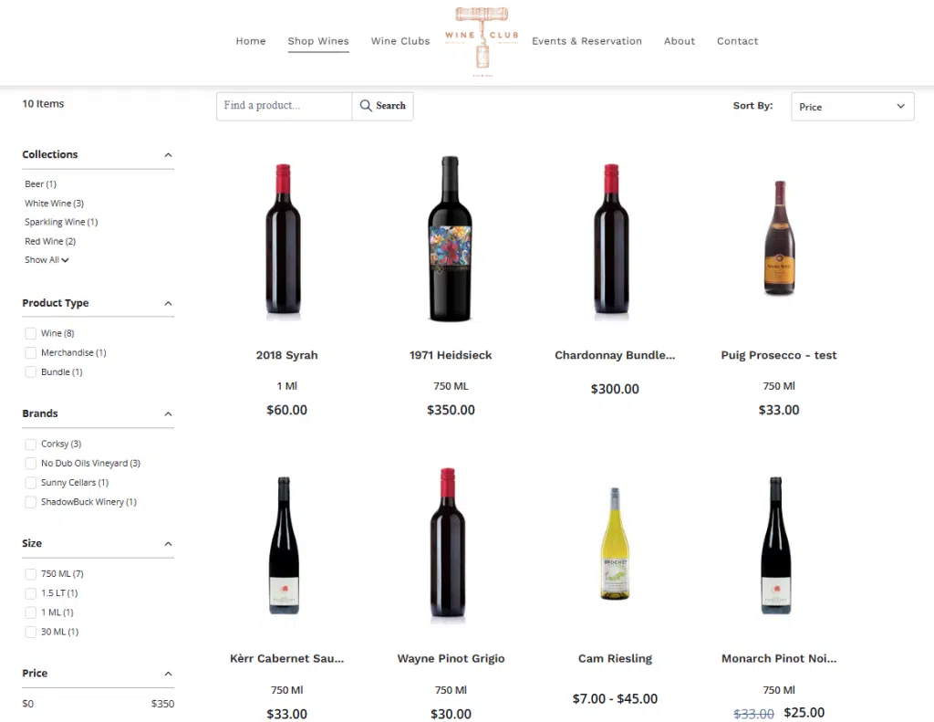 Corksy’s shop page organizes wines with clear filters, pricing visibility, and intuitive navigation, helping customers browse efficiently and build orders faster.
5. Product Pages: Where the Decision Happens
Once a customer clicks into a wine, they are no longer browsing; they are deciding. The job of the product page is to remove hesitation and make the choice feel obvious.
Most wineries handle technical tasting notes well. Structure, acidity, tannin, vineyard details, all important. But technical information alone rarely closes the sale. What often gets missed is context.
Wine is purchased for moments: hosting dinner, bringing a gift, restocking for the weekend, planning a holiday meal. A strong product page helps the customer see themselves opening the bottle.
Instead of stopping at technical descriptors, layer in decision-support language that answers the real questions customers are asking:
- Need a hostess gift that feels thoughtful but safe? This is the bottle.
- Planning pizza and a movie night? This red holds up without overpowering.
- Hosting Thanksgiving? Easy pairing, crowd-friendly, low risk.
- Looking for something that impresses without being polarizing? This fits.
You are not simplifying the wine. You are simplifying the decision.
At the same time, value must be easy to understand. Audit your product pages for structural clarity:
- Is club pricing displayed clearly next to retail pricing?
- Are savings at 6 or 12 bottles obvious without doing math?
- Is price per bottle visible when purchasing in volume?
- Are case incentives reinforced on the page?
- Is shipping threshold messaging visible?
- Are awards, reviews, or social proof used strategically?
Customers hesitate when they have to calculate value manually or guess whether a wine will “work.” Strong product pages remove both uncertainties: suitability and price logic.
When the wine feels like the answer to a specific need, and the value is immediately clear, conversion improves.
6. Shipping Strategy: Transparency First, Behavior Second
Shipping is one of the most influential and sensitive variables in wine DTC. It impacts margin, average order value, and conversion rate simultaneously.
The largest issue is rarely the cost itself. It is surprise.
The gap between what shipping actually costs and what consumers expect to pay continues to widen. Tablas Creek recently wrote about this growing disconnect, highlighting how customer perception and real logistics costs have never been further apart. The takeaway isn’t that wineries should absorb the cost blindly. It’s that expectations must be managed intentionally through clear thresholds, transparent pricing, and structured incentives.
When a customer plans to spend $300 and encounters an unexpected $50 shipping charge at checkout, hesitation increases immediately. Even if the rate is reasonable, the disconnect between expectation and reality suppresses conversion.
Shipping strategy should accomplish two things:
- Build trust through transparency.
- Shape order behavior intentionally.
Transparency comes first. Customers should not discover shipping rules at checkout. Before someone ever reaches cart, your site should clearly communicate:
- What is the free shipping threshold (if one exists)?
- Are flat rates visible?
- Are shipping states clearly listed?
- Is there guidance for states you do not ship to?
- Is pickup clearly differentiated from shipping?
If you do not ship to certain states, say so clearly on the shopping page. Where possible, redirect those customers to a retail locator or invite them to join the mailing list for future availability. Losing the order is one thing; losing the relationship is another.
Once transparency is established, shipping becomes a behavioral lever.
Strong DTC programs align shipping thresholds with margin logic and case incentives. If free shipping begins at 12 bottles, the site should support that behavior long before checkout:
- Reinforce the threshold on shop and product pages.
- Display progress toward free shipping in cart.
- Suggest add-ons when customers are close to qualifying.
- Pair thresholds with case discounts when appropriate.
When structured correctly, shipping thresholds increase average order value while protecting profitability. When hidden or poorly communicated, they create friction and erode trust.
Shipping is not just a logistics setting. It is a conversion design decision.
7. Checkout Friction: Where Revenue Is Won or Lost
By the time a customer reaches checkout, the hard work should already be done. They have selected the wine, justified the purchase, and moved forward with intent.
At this stage, friction, not price, is often what disrupts conversion.
Consumers compare your checkout experience to every modern retailer they use. That expectation carries over whether you are a 5,000-case winery or a global brand.
Small inefficiencies compound quickly:
- Extra required fields
- Slow shipping calculations
- Confusing pickup versus shipping options
- Limited payment methods
- Mobile layouts that require excessive scrolling
Audit your checkout experience on mobile first. A significant percentage of winery traffic originates there, and even slight usability issues can increase abandonment.
Evaluate the following:
- Are Apple Pay and Google Pay enabled?
- Is address entry streamlined?
- Are required fields minimized?
- Is pickup clearly separated from shipping?
- Are shipping costs calculated quickly and transparently?
- Does checkout feel visually consistent with the rest of the site?
For wineries that host club pickup days or high-volume release events, operational alignment also matters. Inventory synchronization between POS and eCommerce must be accurate to prevent overselling or fulfillment confusion. A clean backend protects the frontend experience.
Checkout is not where persuasion happens. It is where confirmation happens.
The objective is simple: remove unnecessary effort. When checkout feels fast, intuitive, and predictable, conversion rates improve without additional marketing spend.
8. Wine Club Integration: Acquisition and Retention Working Together
Wine club deserves its own dedicated section on your website. It should be easy to find, clearly explained, and thoughtfully structured.
But it should not live in isolation.
Too often, wine club pages are built solely to sell new memberships. Once someone joins, the experience shifts entirely into account login, with no clear hub for benefits, updates, or easy communication.
Strong wine club architecture serves two audiences at once:
- Prospective members evaluating whether to join
- Existing members who need reminders, access, or support
Start by evaluating the acquisition side:
- Is the value proposition clearly articulated?
- Are savings quantified?
- Are tiers easy to compare?
- Are benefits specific and immediate?
- Can someone join directly from product pages or checkout?
Then evaluate the member experience:
- Is there a clearly accessible club hub or landing page?
- Can members easily review benefits without logging in?
- Is there a simple way to contact the club manager (form, chatbot, or direct link)?
- Are event perks and member-exclusive releases clearly surfaced?
- Are pickup instructions and release timelines easy to find?
Wine club marketing is multifold. You are simultaneously selling new memberships and reinforcing VIP status for existing members.
If members cannot easily remind themselves why they joined, the perceived value erodes over time. If contacting the club manager requires navigating a generic contact page, friction increases. If benefits feel hidden or buried inside account settings, engagement drops.
Club architecture should reinforce exclusivity without adding complexity. Members should feel recognized. Prospects should feel compelled.
When acquisition and retention are structured together, wine club becomes more than a subscription. It becomes a central pillar of your DTC strategy.
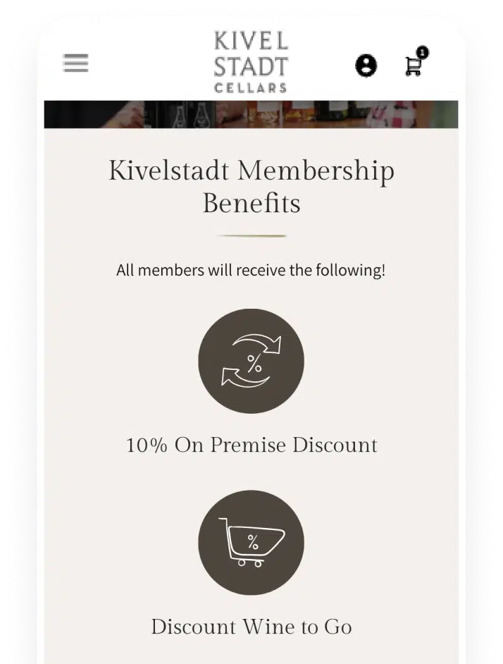 Kivelstadt Cellars’ wine club sign-up and benefits page is optimized for mobile, helping visitors quickly understand membership value and join from any device.
9. Email, Data, and Behavioral Visibility
Most wineries evaluate email performance based on opens and clicks. That’s only part of the story.
The more important question is what happens after the click.
If you cannot see how email traffic behaves on your site, what products are viewed, where abandonment occurs, whether club pages are visited, you are optimizing in partial darkness.
Email and website behavior should not operate separately. They should inform each other.
Start with basic behavioral visibility:
- Can you track product views after an email click?
- Are abandoned cart triggers SKU-specific?
- Do you know which campaigns drive 6-bottle orders versus 12-bottle orders?
- Can you measure club signups tied to specific sends?
- Do you know whether email traffic converts differently than paid or organic traffic?
If those answers are unclear, the issue is rarely marketing creativity. It is tracking architecture.
From a technical standpoint, confirm that:
- GA4 is configured properly with ecommerce tracking enabled.
- Google Tag Manager is firing cleanly across add-to-cart, checkout start, and purchase events.
- UTMs are consistently applied across email, paid, and social campaigns.
- Revenue attribution reflects real transaction data.
- Key events such as wine club signups, event registrations, and shipping threshold triggers are measurable.
Data must be harvestable before it can be strategic.
Once visibility is clean, segmentation becomes the lever.
Modern DTC performance depends on moving beyond blanket campaigns. AI-driven or rule-based segmentation allows you to identify:
- Customers who consistently build 12-bottle orders.
- Shoppers who stop at 3 bottles unless incentivized.
- High-lifetime-value buyers who should be targeted for club upgrades.
- Repeat browsers who have not yet converted.
- Members approaching churn risk based on behavior.
When segmentation is aligned with site behavior, email stops being a broadcast tool and becomes a revenue optimization engine.
The goal is not simply to send more campaigns. It is to use behavioral data to influence how, when, and what customers purchase.
When email, website behavior, POS data, and CRM history operate in a unified view, decision-making becomes proactive instead of reactive.
That shift is where meaningful revenue gains happen.
What a Winery Website Audit Can Actually Unlock
Consider a mid-sized winery generating:
- 25,000 monthly visitors
- 2.0% conversion rate
- $168 AOV
That results in:
- 500 monthly orders
- $84,000 in monthly revenue
- Approximately $1,008,000 annually
Now improve:
- Conversion to 2.6%
- AOV to $182
The result becomes:
- 650 monthly orders
- $118,300 in monthly revenue
- Approximately $1,419,600 annually
That is more than $400,000 in incremental annual revenue without increasing traffic.
This is the leverage of conversion architecture.
Patterns Observed in High-Performing Winery DTC Programs
Across the stronger wineries, structural elements consistently include:
- Case incentives paired with intentional shipping thresholds
- Club pricing embedded throughout the buying journey
- Express checkout enabled
- Personalized nudges for repeat visitors
- Behavior-based email automation
- Unified POS and online data visibility
None of these tactics are flashy. They are structural. And they are measurable.
Why Website Architecture Matters
Running a conversion audit is straightforward in theory.
Execution becomes complex when:
- POS and eCommerce are disconnected
- CRM data lives separately
- Club pricing cannot be dynamically displayed
- Cart logic cannot be configured
- Email attribution is incomplete
All-in-one systems reduce operational friction and allow wineries to implement behavioral adjustments faster.
The benefit is not simply consolidation.
It is strategic flexibility.
Closing
Conversion is not a campaign. It is architecture.
Most wineries do not need more traffic. They need tighter alignment between how customers browse, how value is presented, how thresholds are reinforced, and how data is used to guide decisions.
Before increasing spend or layering on additional promotions, refine the system that turns visitors into buyers.
For wineries operating on integrated platforms, many of these adjustments can be implemented quickly, from shipping logic to club pricing visibility to behavior-based segmentation. For others, the first step is simply visibility.
Run the audit. Identify the friction. Tighten the structure. If you need help with your audit or would like to review the results with our team, let us know!